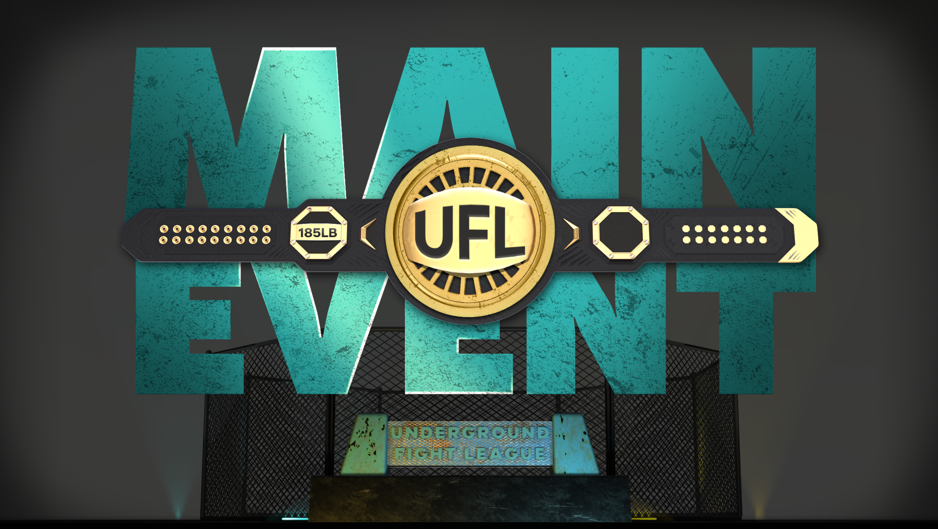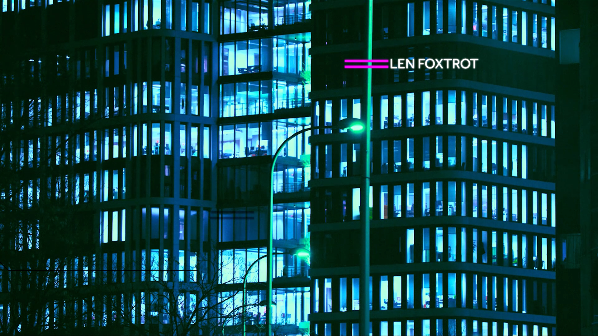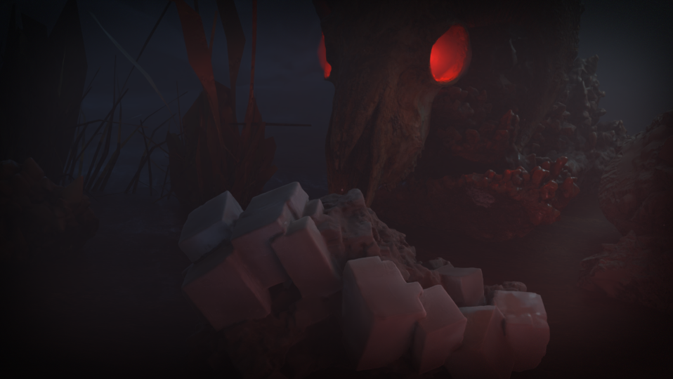
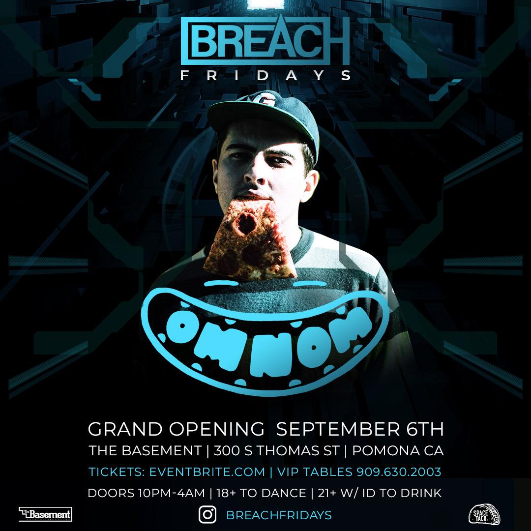
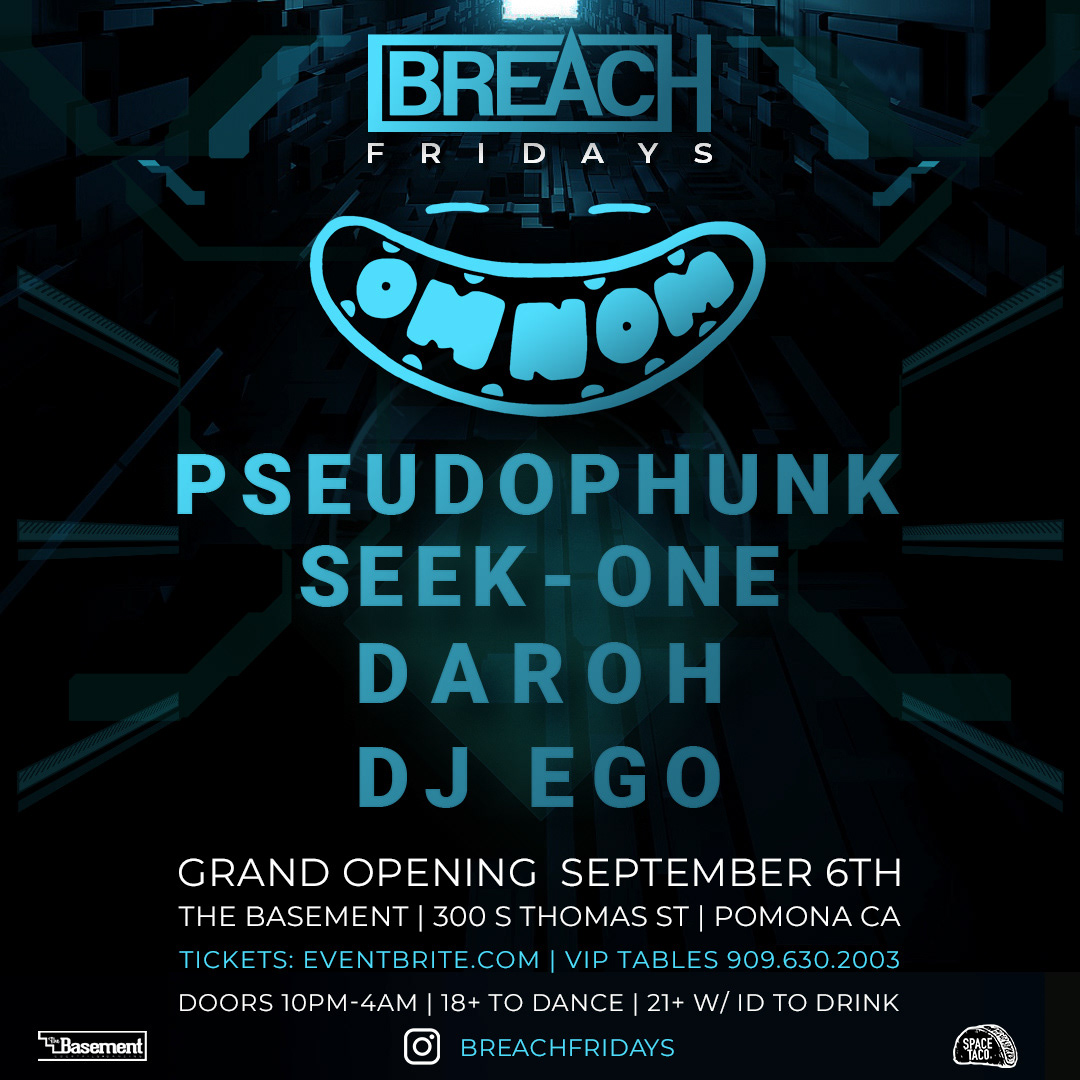
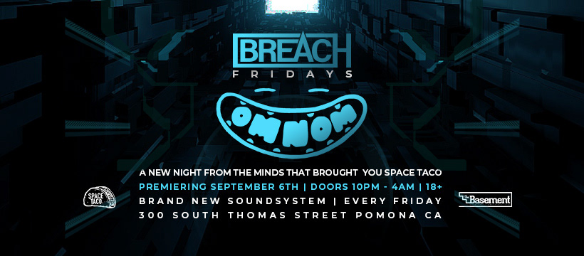
CHALLENGE: Brand, design, and execute collateral that will attract nightclub attendees to new promotion. This event is upscale, booking larger name DJs, catering to a wider audience. Must overcome preconceptions from competing Tuesday night at same club with similar music. Needs to feel different from other brand. Visual package must include logo, stage visuals, weekly flyer template.
ADDITIONAL BRIEF INFO:
-Need logo that feels clean, modern, edgy. Needs to convey “premium” brand.
-Target demo M&F 18-35.
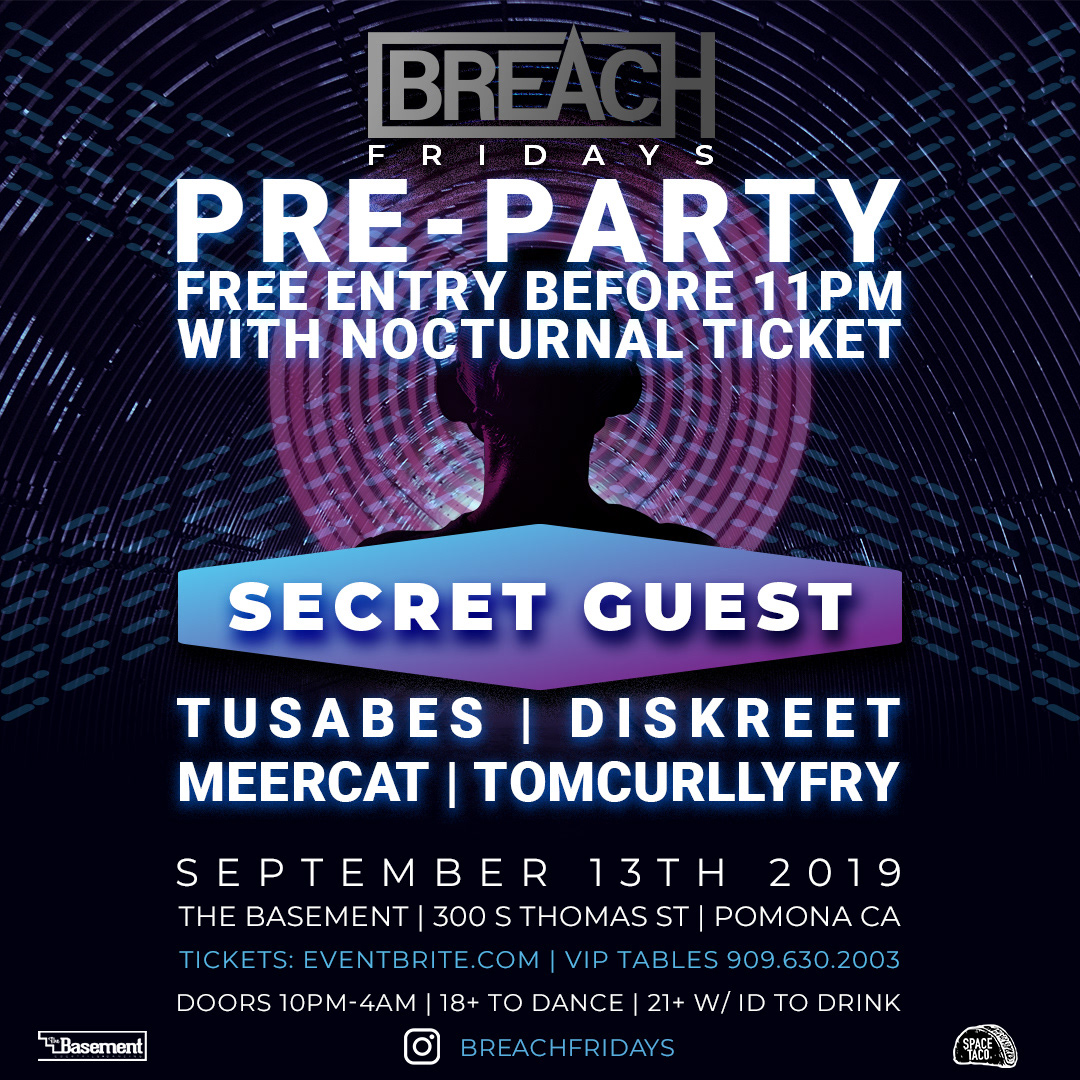
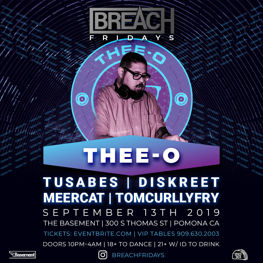
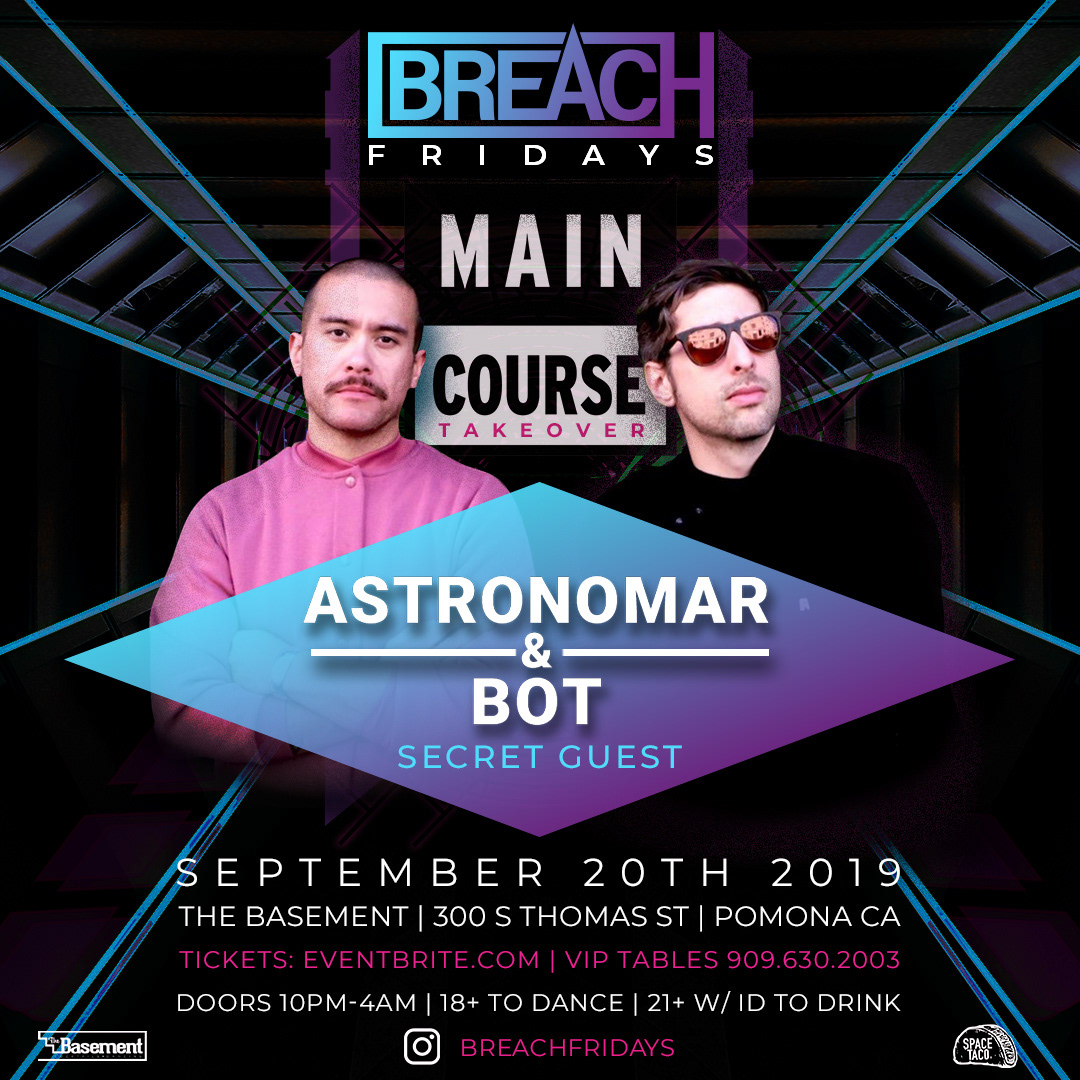
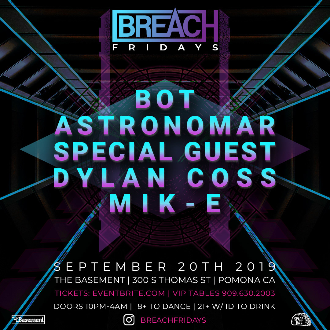
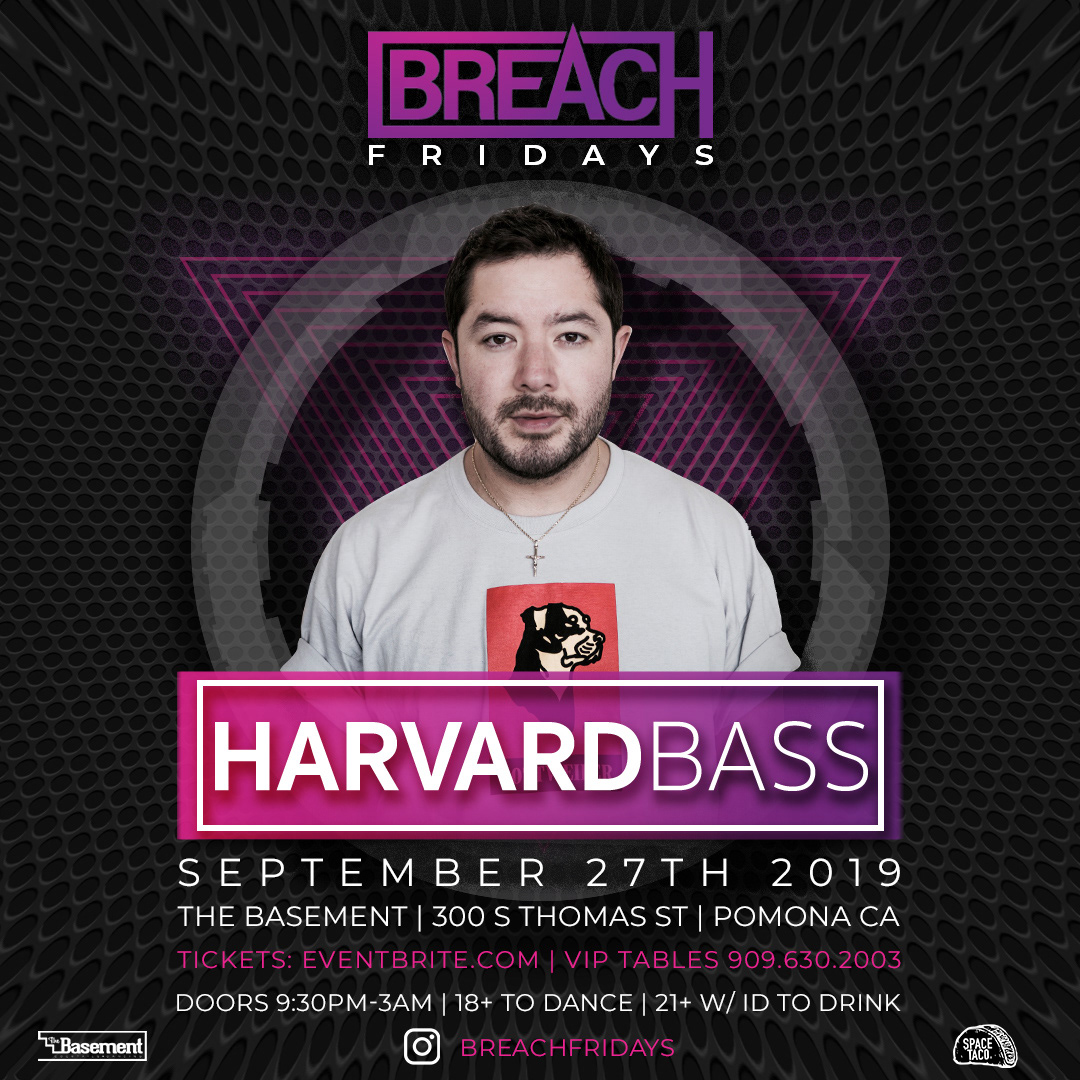
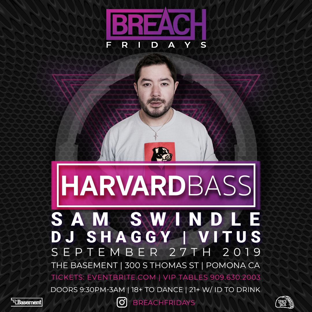
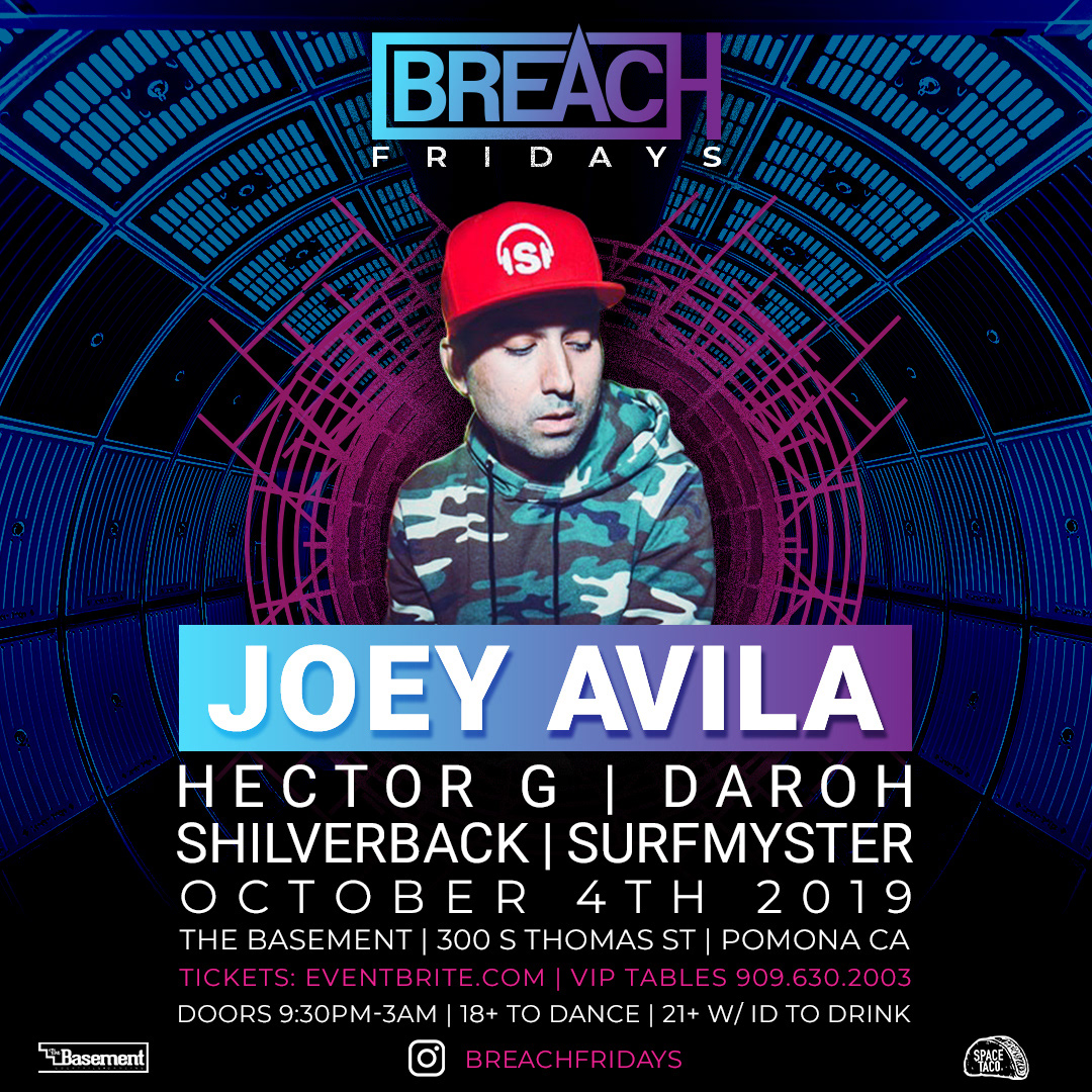
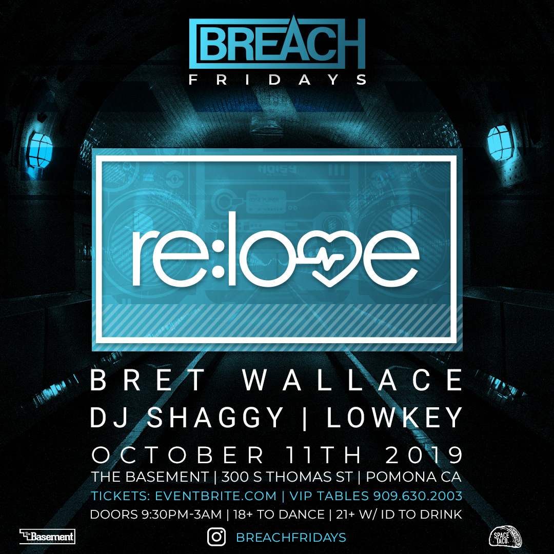
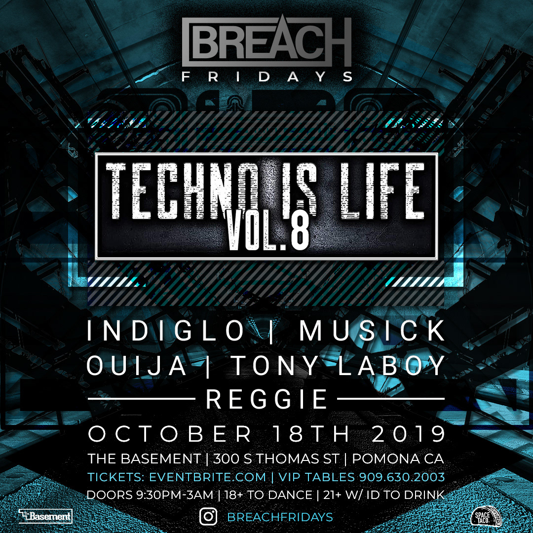
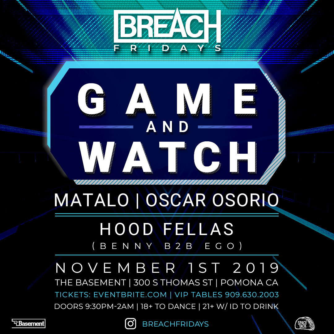
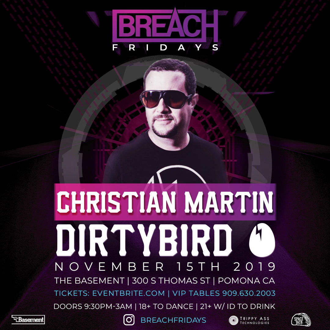
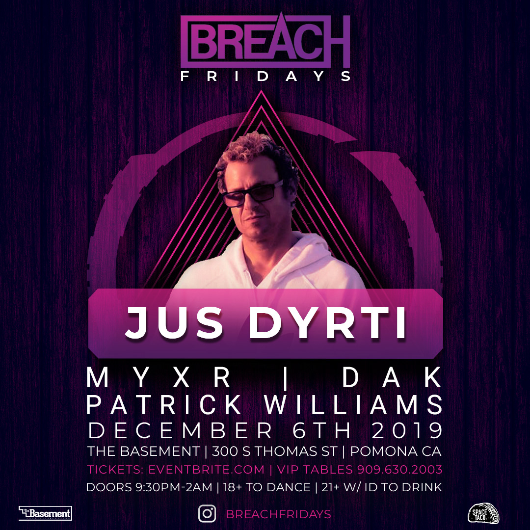
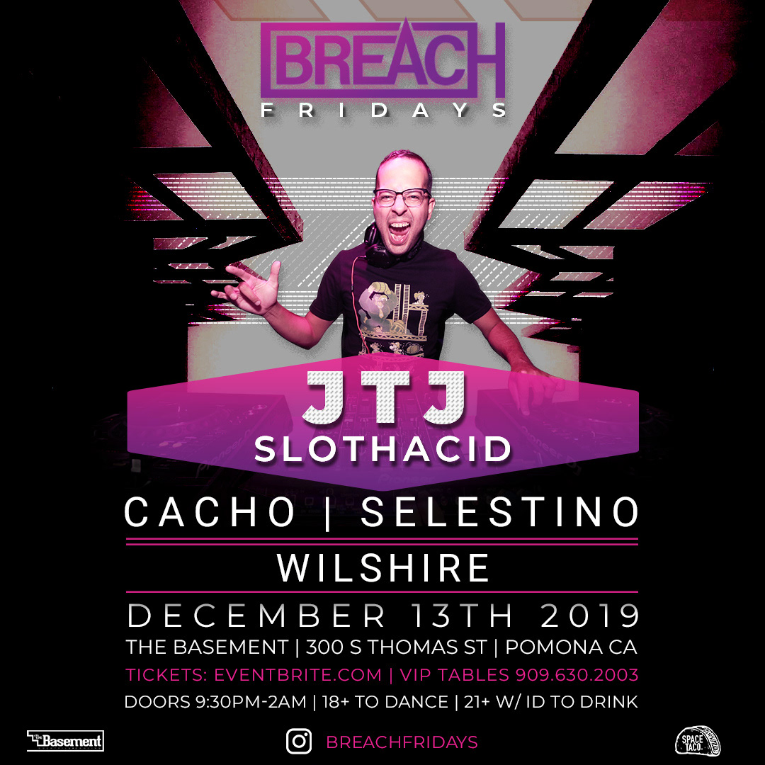
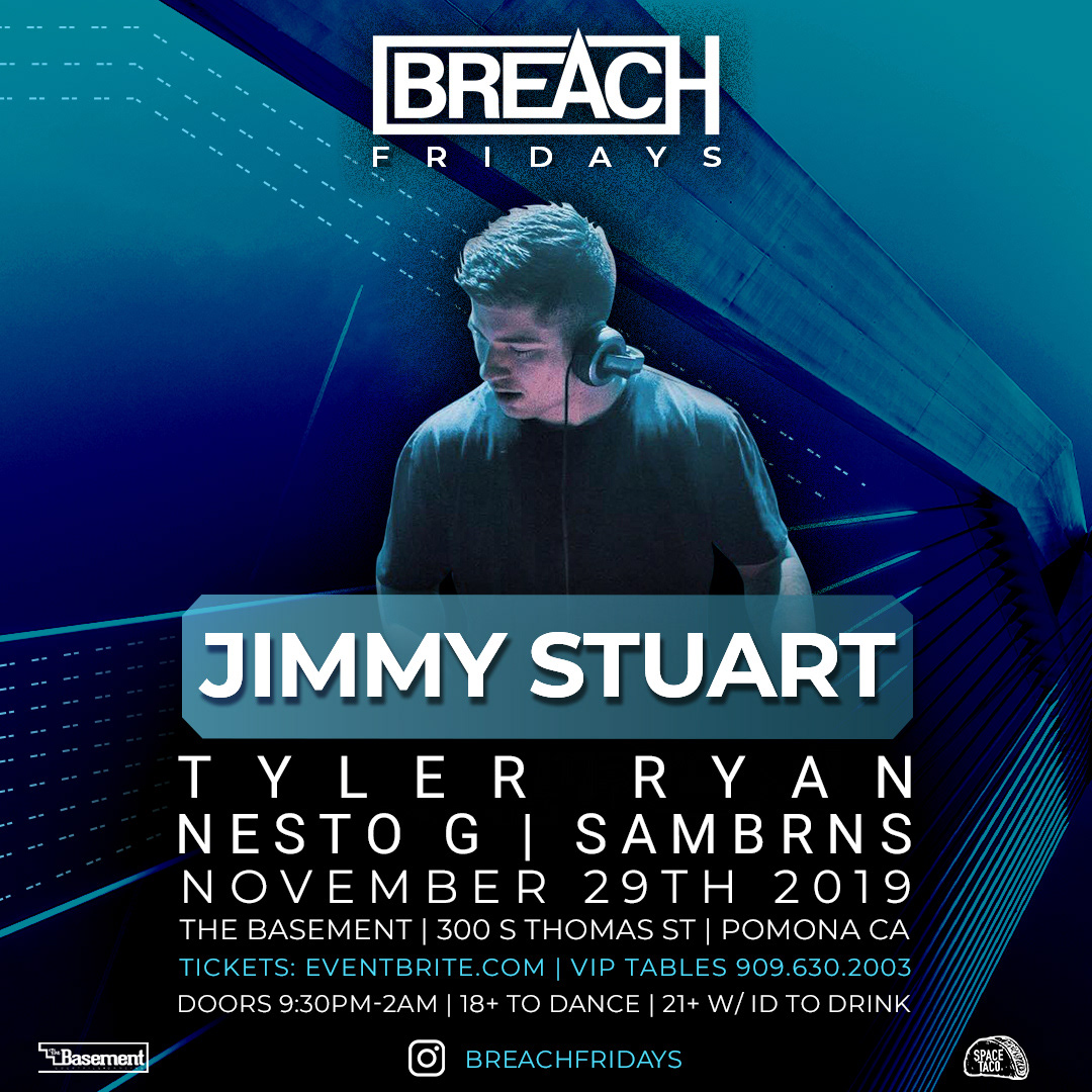
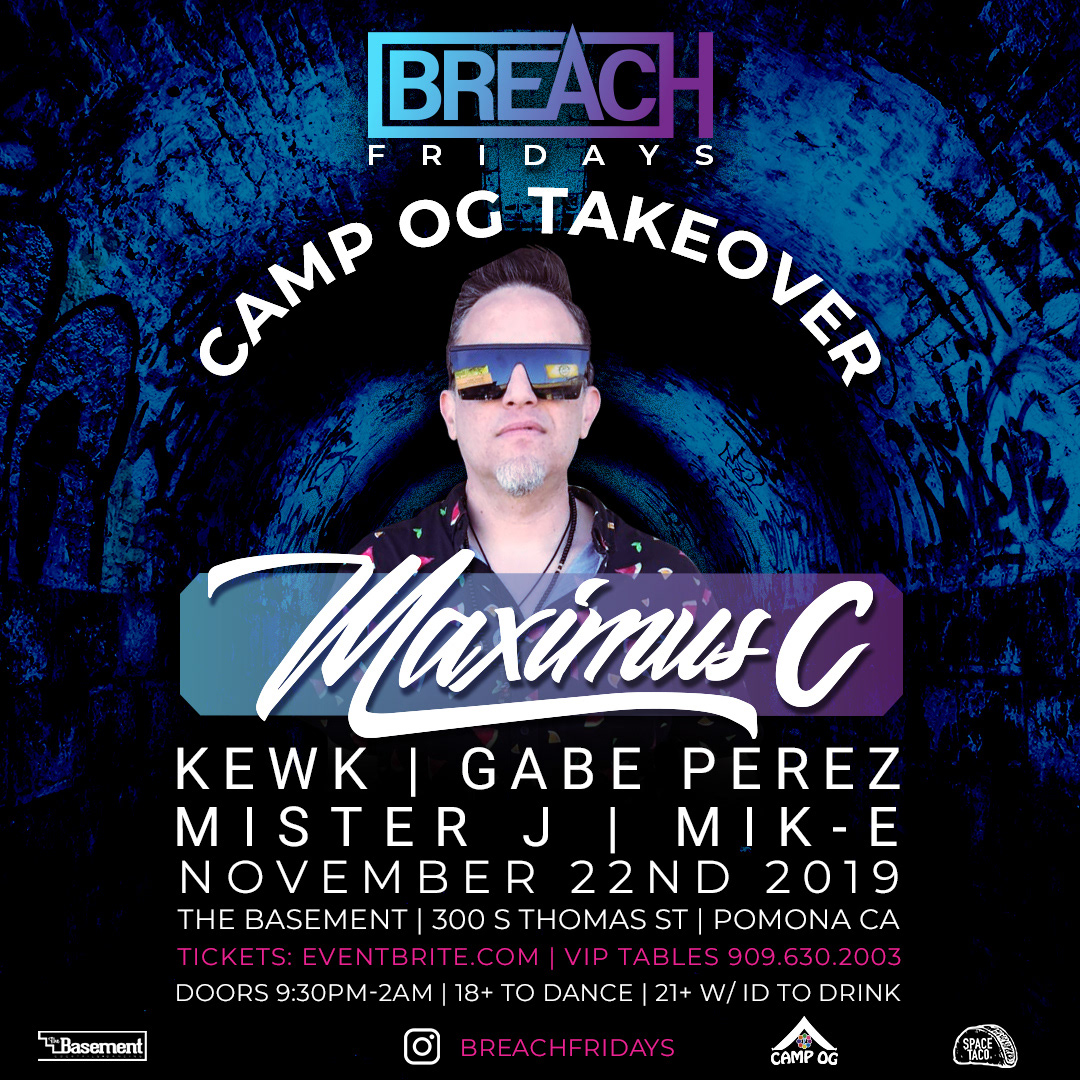
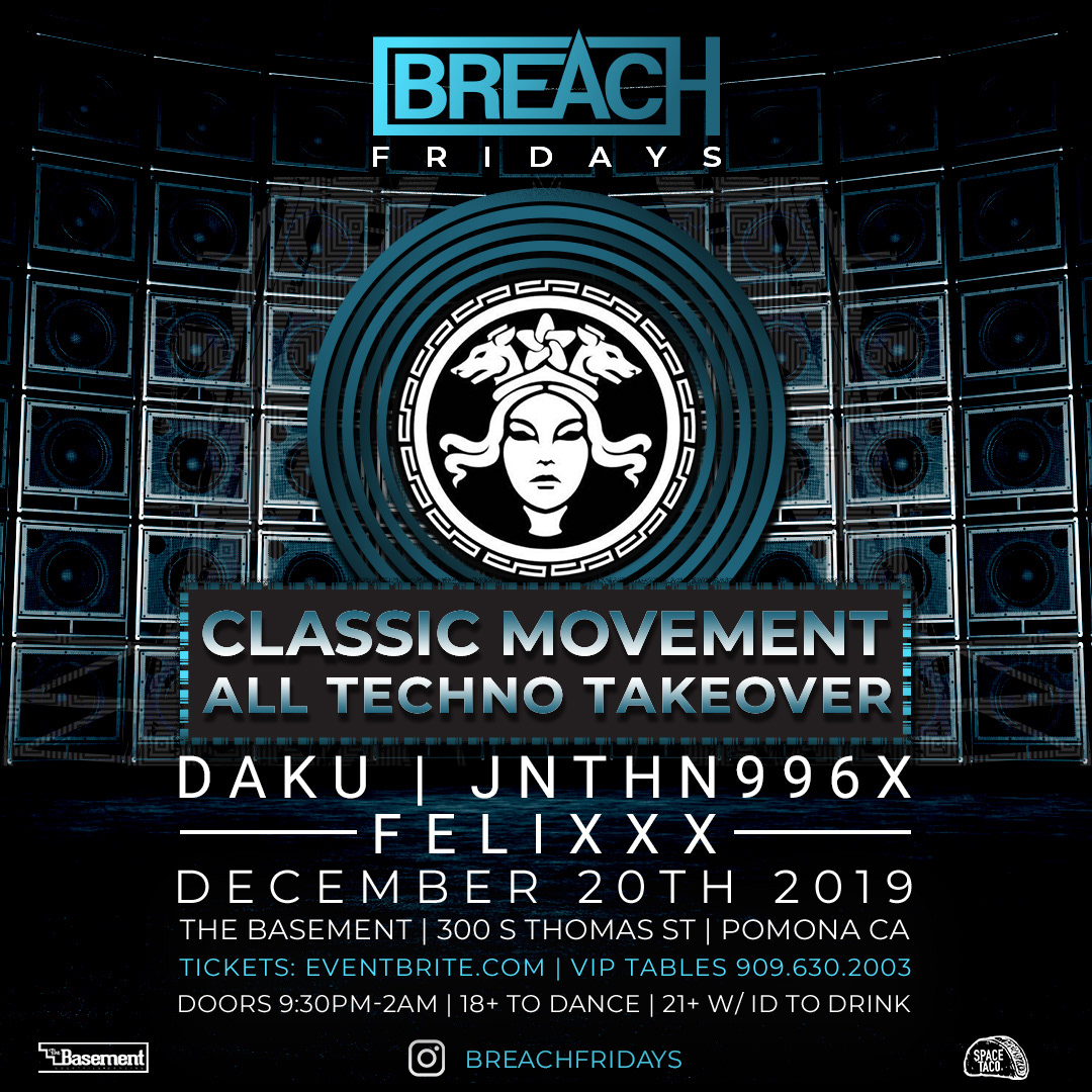
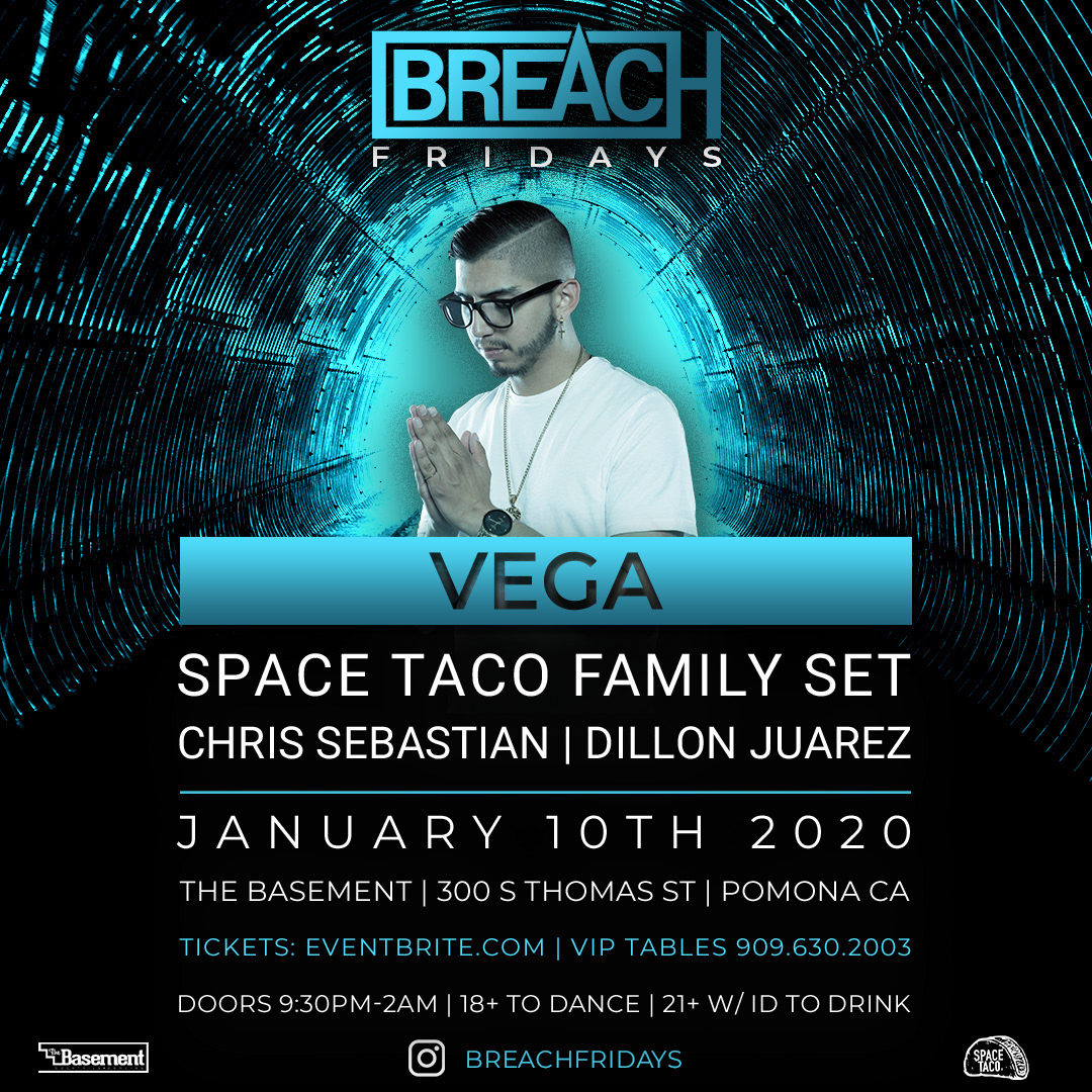
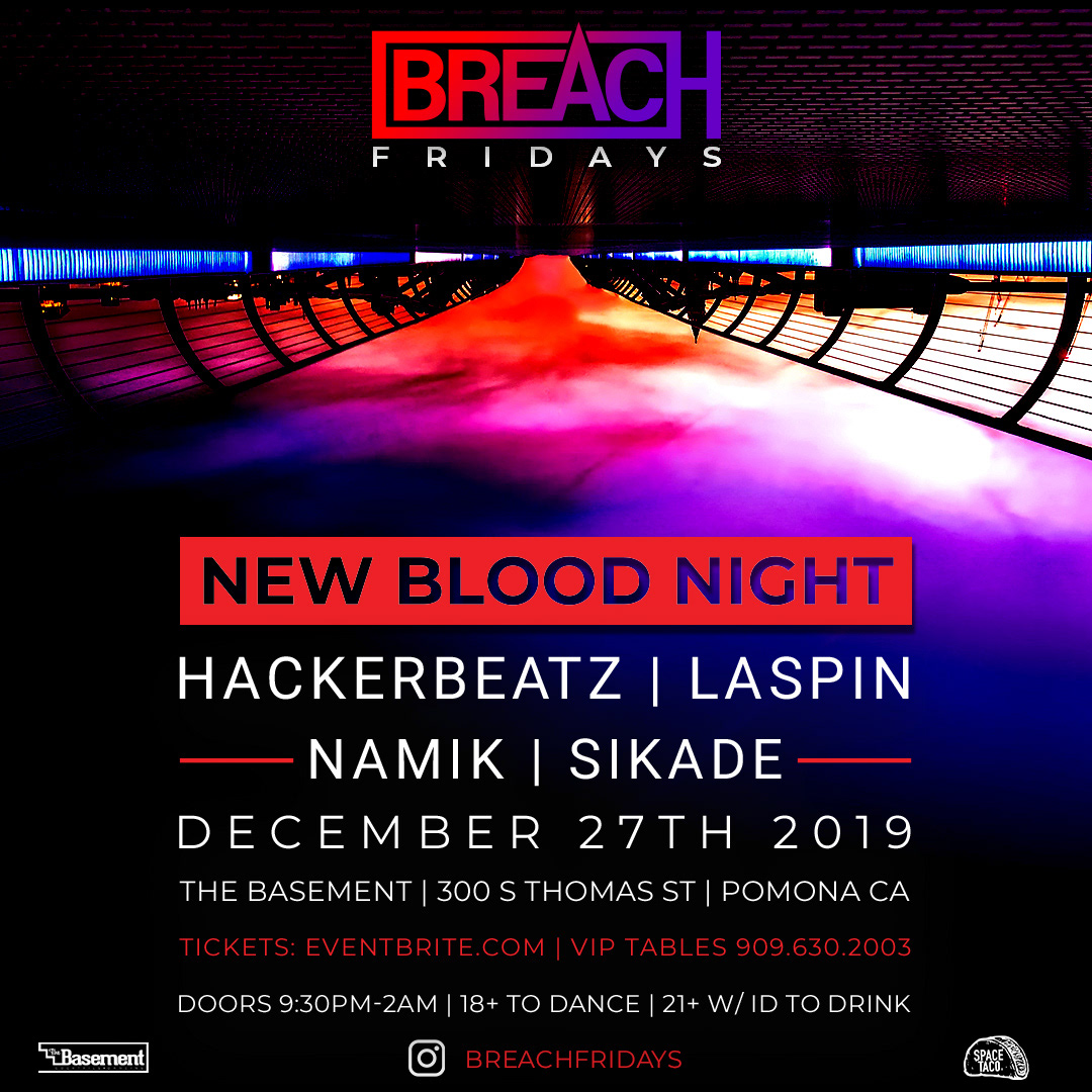
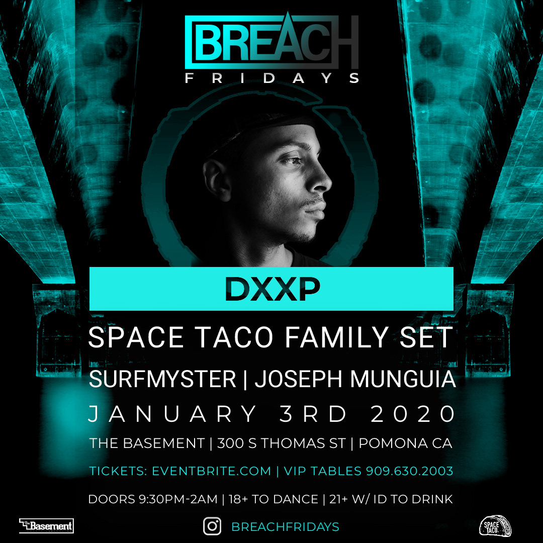
-Want flyer to have a “brand format” so easily recognizable in social feeds. i.e. Insomniac. -Overall aesthetic should be clean & modern.
Process Notes:
Design is a process. It requires listening, understanding, ideating, and iterating.
We value transparency and learning, and believe in showing the process as a whole.
Our process generally includes 3 style scapes, and 2-3 rounds of revisions once a direction is agreed upon.
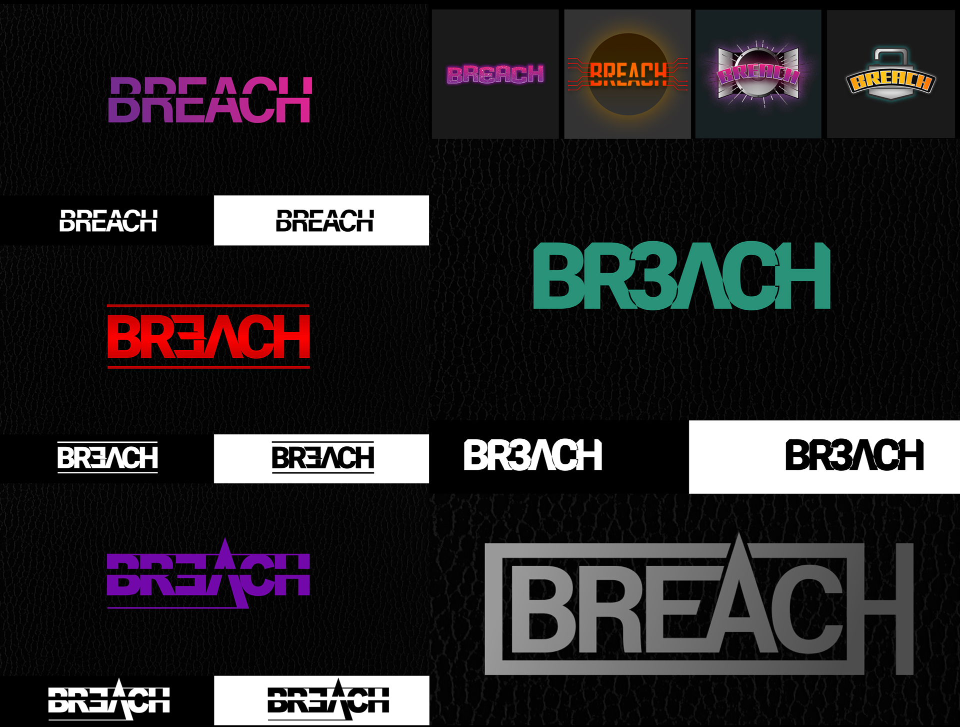
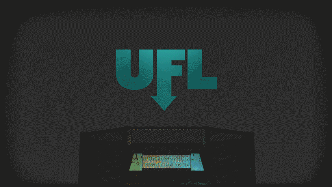
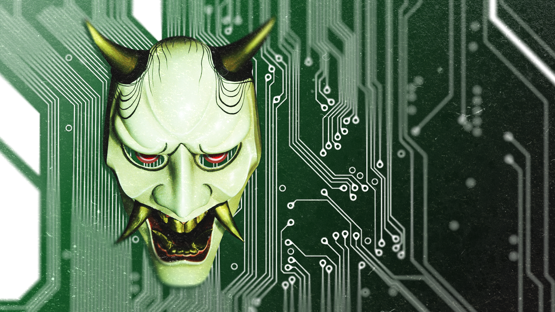
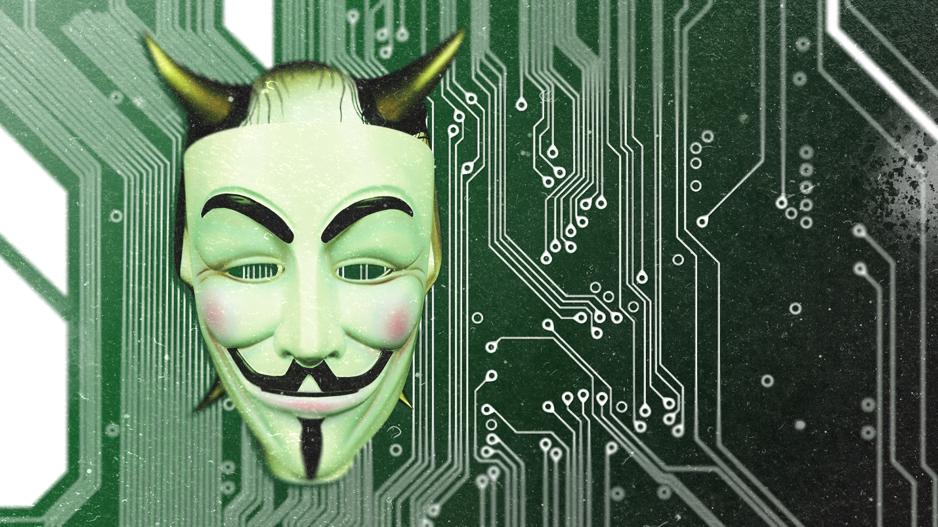
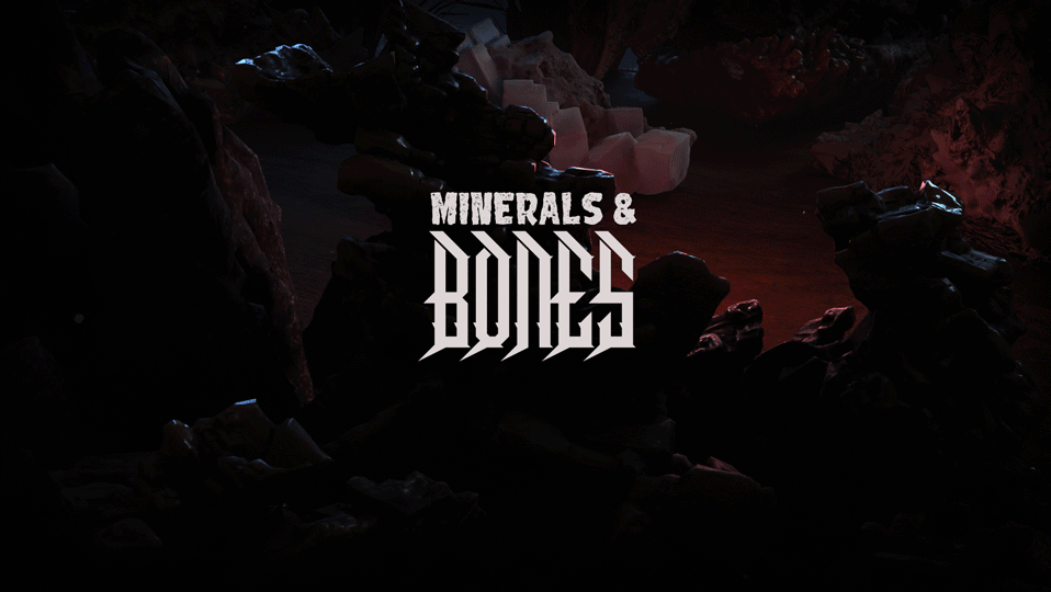
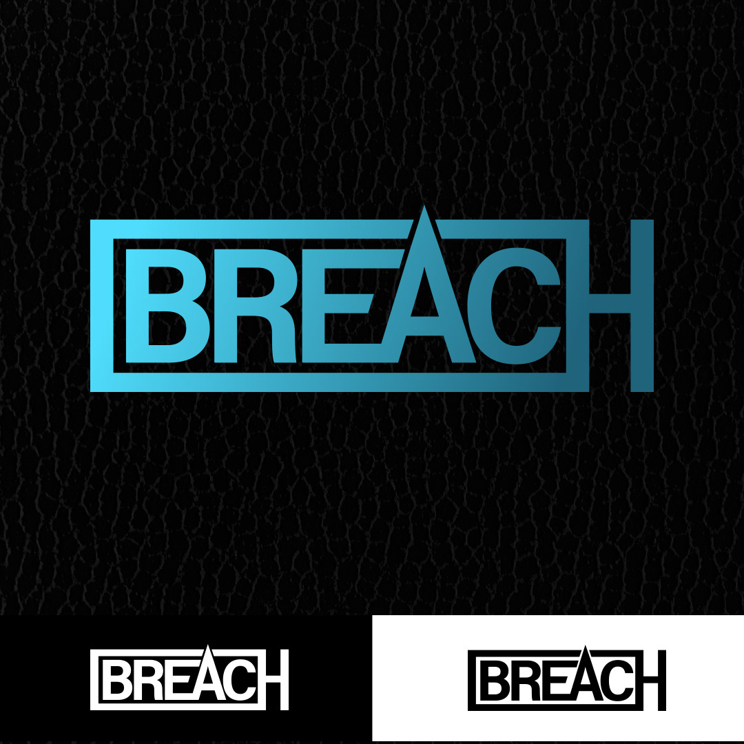
With Breach, the brief was very open, so we brought 4 initial variant concepts, none of which hit the mark. (shown top right, below)
Leaning on the concepts of breaching the surface, a data breach, breaching a door, breaching a lock, the promoters liked the ideas, but not the execution. After reviewing round one and hearing what they had to say about the work presented, it became clear the design needed to be logotype, and a lot simpler in appearance.
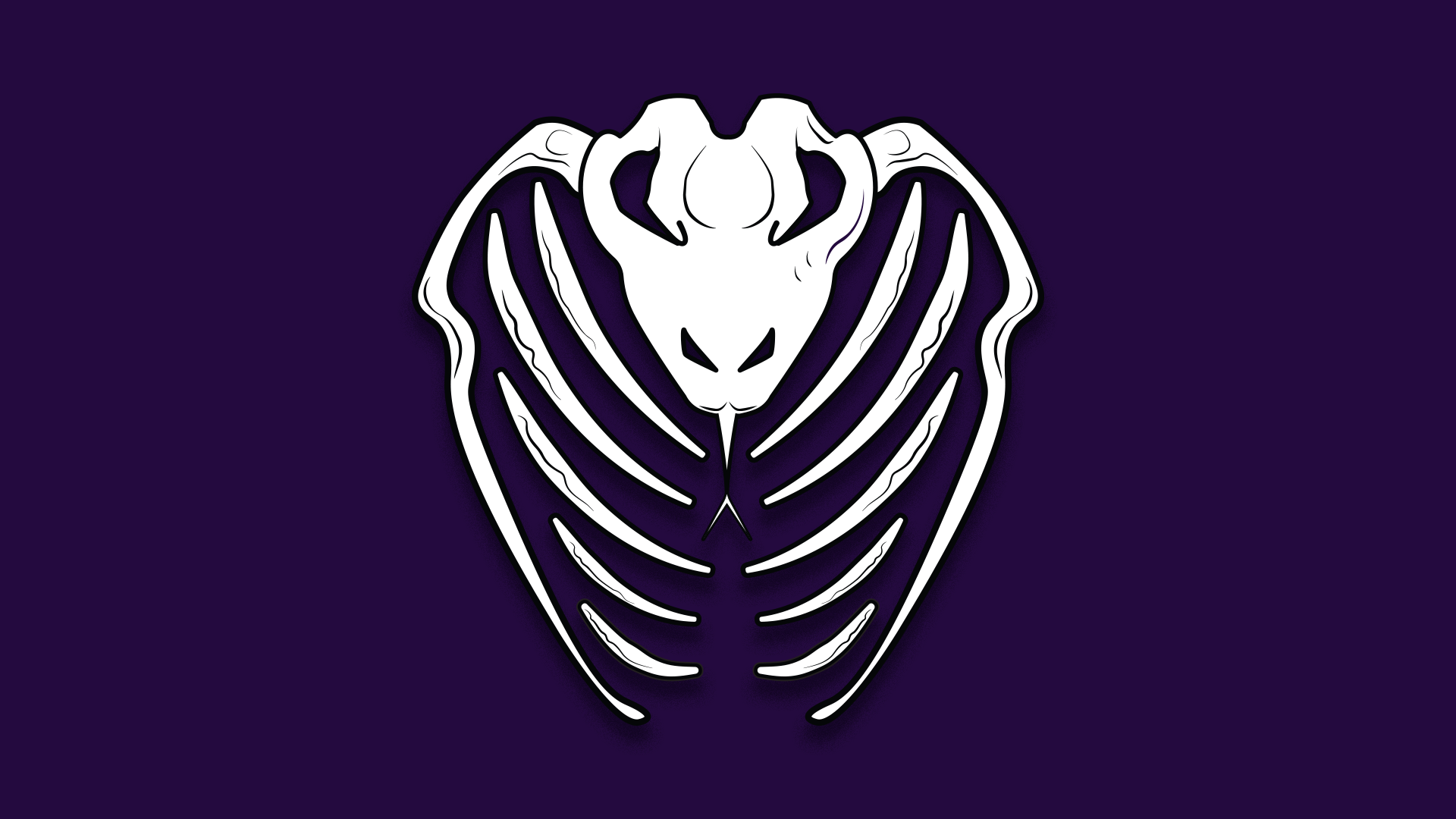
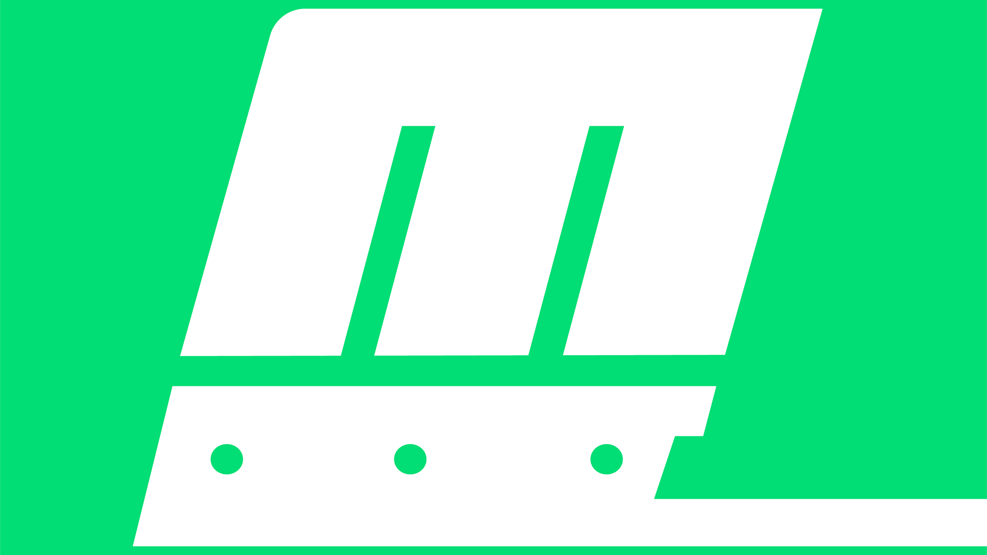
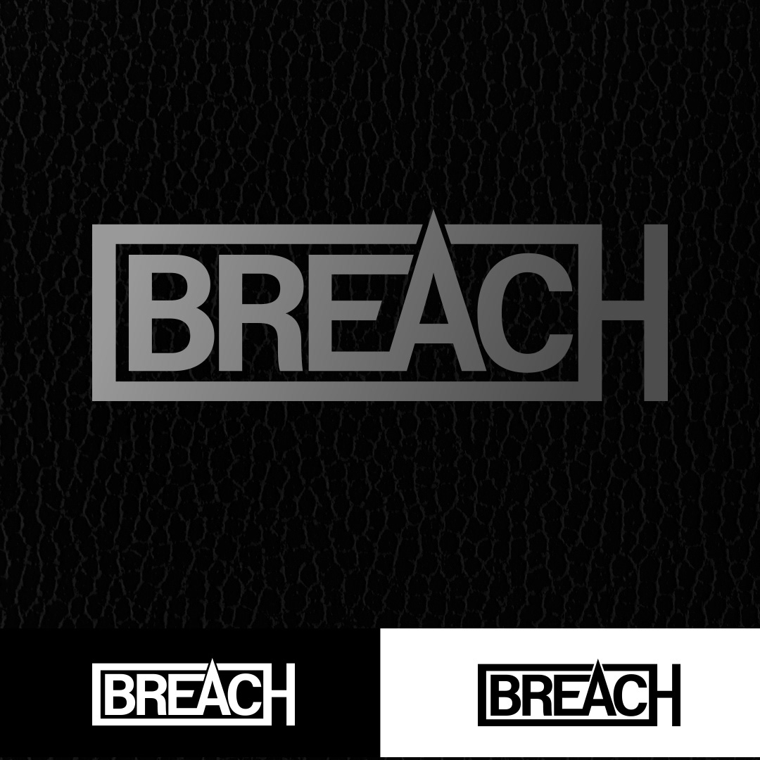
Client responded well to typeset, text-only logo, wanted clean simple. Several text iterations- concept of “breached” text form- Letters breached by bar, Icon with reversed letterforms, and concept where “A” ascender ‘breaches’ the margins for the text. Finally, landing on the logo displayed lower right.
Combining several previous concepts, logotype looks like door-breaching ram used by special forces and police, symbolizing breaking into the scene, and opening the door for new artists to break through. The “A” breaches the boundary of the ram, visually reinforcing the concept.
We value transparency and learning, and believe in showing the process as a whole.
Our process generally includes 3 style scapes, and 2-3 rounds of revisions once a direction is agreed upon.
With Breach, the brief was very open, so we brought 4 initial variant concepts, none of which hit the mark. (shown top right, below)
Leaning on the concepts of breaching the surface, a data breach, breaching a door, breaching a lock, the promoters liked the ideas, but not the execution. After reviewing round one and hearing what they had to say about the work presented, it became clear the design needed to be logotype, and a lot simpler in appearance.
Client responded well to typeset, text-only logo, wanted clean simple. Several text iterations- concept of “breached” text form- Letters breached by bar, Icon with reversed letterforms, and concept where “A” ascender ‘breaches’ the margins for the text. Finally, landing on the logo displayed lower right.
Combining several previous concepts, logotype looks like door-breaching ram used by special forces and police, symbolizing breaking into the scene, and opening the door for new artists to break through. The “A” breaches the boundary of the ram, visually reinforcing the concept.